
Capability: context panel
approvedOne panel component, three content views, opened from the trigger rail. The panel presents the context around a video beside or over the player.
Purpose
Give users the context of a video (its essence, key concepts, research field, transcript, source publication, and related videos) without leaving playback.
Behavior
- One panel component with three views; a view may carry internal tabs:
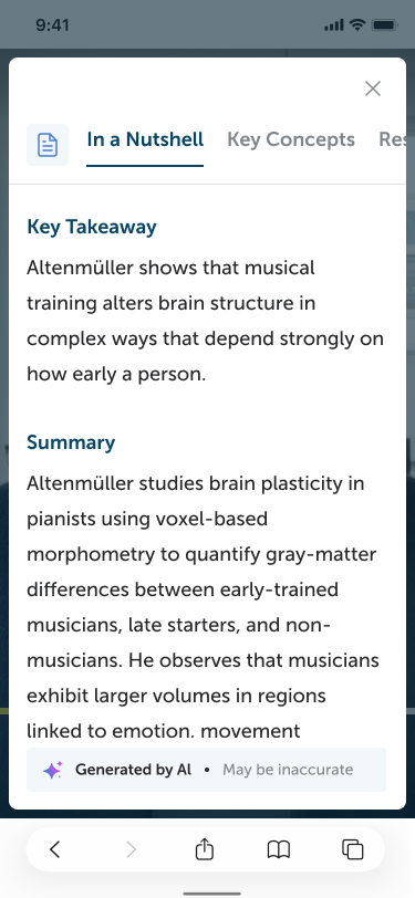
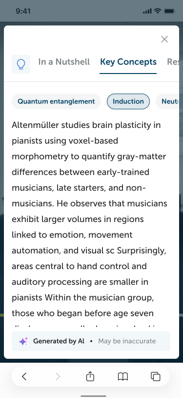
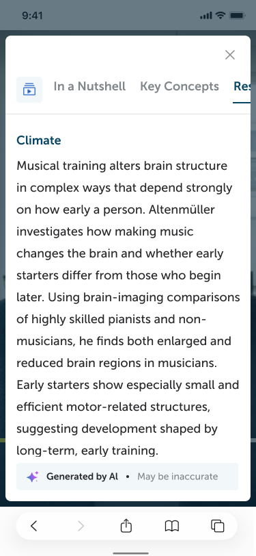
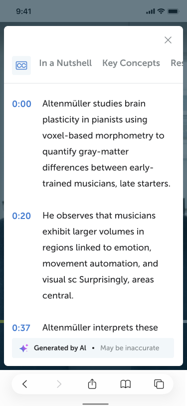
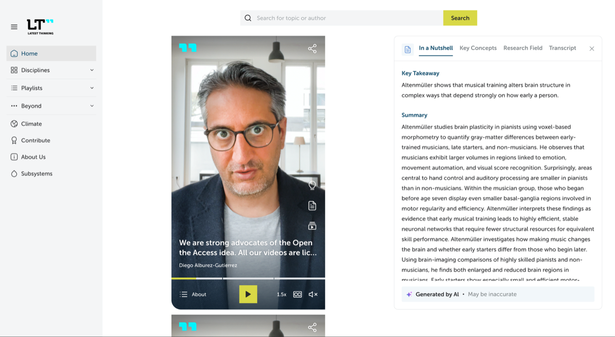
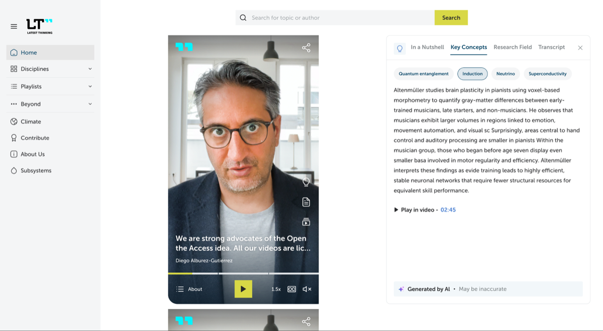
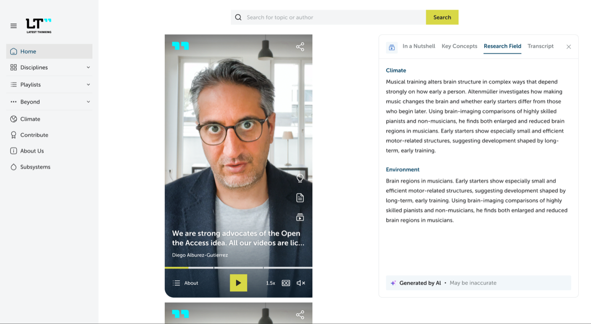
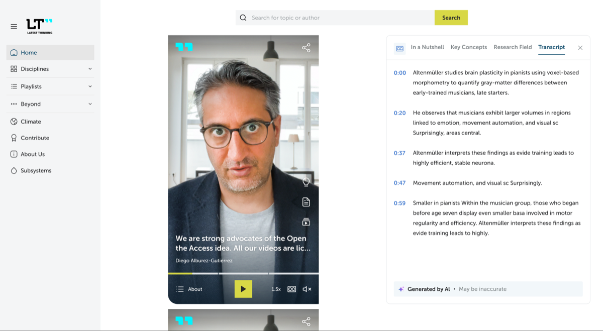
- Knowledge view (lightbulb trigger): tabs In a Nutshell (key takeaway and summary), Key Concepts (selectable chips with descriptions), Research Field (titled sections), and Transcript (timestamped entries).
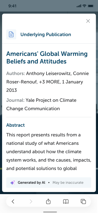
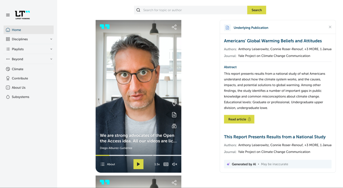
- Underlying Publication view (paper trigger): one or more publications, each with title, authors, journal, abstract, and an external download link.
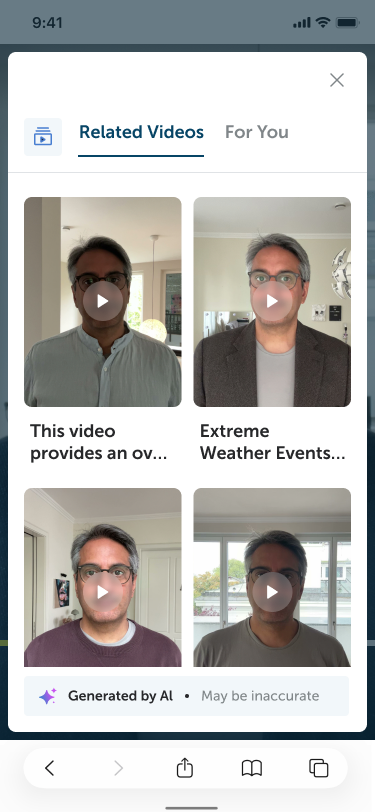
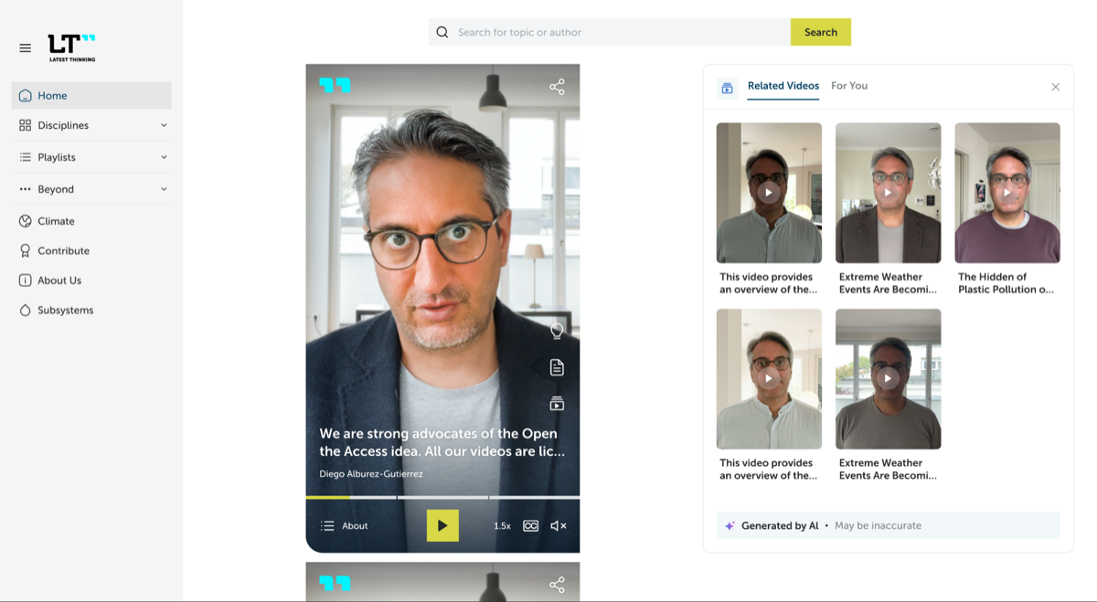
- Related Videos view (stacked-players trigger): tabs Related Videos and For You, a grid of video cards.
- The panel header always shows the trigger's icon, constant while switching internal tabs. This deliberately deviates from design frames in which the header icon varies per tab.
- Presentation adapts to measured space rather than device-sniffing:
- a side card floating beside the player's right edge when the measured presentation stage can fit it without covering or clipping page content;
- a viewport-sized top-layer dialog otherwise.
- The dialog is deliberately sized from the visual viewport rather than the player. A small embedded player therefore still opens a readable panel.
- The "Generated by AI • May be inaccurate" footer appears when the shown section carries
generatedByAi: truein content. - Governance: the player instance owns its panel. Panel content follows the instance's current configuration. When the instance receives a new configuration (for example in the publications feed), an open panel stays open and refreshes to the same view, closing only if that view has no data in the new configuration.
Surface in landscape
Not rendered at this stage: landscape omits the trigger-rail and context-panel surfaces, to be revisited when a landscape surface is designed. The capability still resolves from the same configuration and defaults in both layouts; omitted surfaces are silently ignored. openPanel(view) on an instance whose layout owns no panel surface is a silent no-op, even when that view's metadata section is present.
Surface in portrait
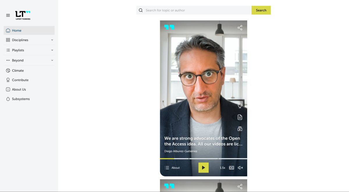
- The trigger rail sits on the right edge above the playback Identity region: lightbulb, paper, stacked players.
- A trigger renders only when its view has data (per-view dormancy).
- Side card or dialog per the space rule above.
Responsive presentation
The player host parent's content box is the presentation stage by default. A hosting structure may declare a wider presentation stage with data-ltp-presentation-stage; the capability then uses that marker element's rectangle while retaining the host parent's children as the foreign-content set. The feed declares its scroller as this wider stage. When a capability surface is portalled outside that stage, it may request vertical feed navigation by dispatching the internal ltp-presentation-navigation event on its resolved presentation-stage element. The stage owner decides whether the request is handled. The side-card algorithm uses the measured player, stage, and foreign sibling rectangles:
- The card is
420pxto650pxwide and exactly the player height. - The player-to-card gap is
32pxto192px, preferring the lesser of192pxand12%of the stage width. - The stage keeps a
32pxouter allowance beyond the card. - The card may appear only on the player's right.
- Let
availableBesidePlayer = stageWidth - playerWidth - 32px. Side-card mode is eligible when that value is at least the420pxminimum card plus the32pxminimum gap. The actual gap ismax(32px, min(preferredGap, availableBesidePlayer - 420px)), so it degrades toward32pxbefore the presentation falls back to a dialog. The card width is thenmin(650px, availableBesidePlayer - gap). - Before giving up on side-card mode, clamp that width to the actual stage space remaining after the player's right edge, the chosen gap, and the
32pxouter allowance. If the result is below420px, retry once with the32pxminimum gap and clamp again. The dialog wins only when the retry still cannot provide the minimum card width. - The candidate must remain inside the presentation stage, avoid every foreign sibling, and avoid ancestor clipping that could hide it. If any of those conditions is uncertain, the dialog wins.
- The visual viewport never participates in side-card eligibility. The side card is page content beside the player and may extend below or above the viewport exactly as the player itself does; scroll and movement tracking keep it aligned.
The constrained presentation is a native top-layer dialog sized from the visual viewport:
- Its inset is
8pxplus the applicable safe-area inset on each edge. - Its width is the lesser of
650pxand the available visual-viewport width after those insets. - Its height fills the available visual-viewport height after those insets.
- Viewport-relative sizing is authorized only for this top-layer dialog. Player-shell geometry remains container-relative.
The mobile Figma frame establishes the rule: a 375 × 696px web-content viewport contains a 359 × 680px panel, exactly 8px inside each edge. The browser backdrop and modal inertness cover the page while the white panel occupies that inset viewport surface.
Resize-driven transfers between the side card and dialog preserve the public view, internal tab, and selected concept without emitting panel open or close events. The docked side card is exposed as a nonmodal dialog landmark with aria-modal="false"; the constrained presentation remains a modal native dialog. Its horizontal tabs retain Left, Right, Home, and End. Up and Down request presentation navigation unless the focused element or a closer ancestor consumes vertical arrows, including a genuinely overflowing scroll region. The side card enters with the reference transition: opacity over 220ms ease and a horizontal slide over 340ms cubic-bezier(0.22, 1, 0.36, 1). The capability tracks and follows player movement while open; causing or animating that player movement remains feed-page behavior.
Configuration
- The views read their data from
content.metadata; the capability holds no content of its own. capabilities.contextPanel: falsedisables the whole capability. Finer options are defined when implementation needs them.
{
  "capabilities": {
    "contextPanel": false
  }
}
Omitted or true, the capability is enabled and each view renders exactly when its section exists in content.metadata (see the config contract for the metadata shapes).
Strings
Authored metadata remains content. The catalog owns view navigation, headings, actions, and accessibility labels.
| Key | English default | Placeholders | Appears in |
|---|---|---|---|
openKnowledge | Open knowledge | none | Knowledge trigger aria label |
openUnderlyingPublication | Open underlying publication | none | Publication trigger aria label |
openRelatedVideos | Open related videos | none | Related-videos trigger aria label |
closeContextPanel | Close context panel | none | Panel close control |
knowledge | Knowledge | none | Accessible panel title and Knowledge tab-list label |
inANutshell | In a Nutshell | none | Tab label |
keyTakeaway | Key Takeaway | none | Section heading |
summary | Summary | none | Section heading |
keyConcepts | Key Concepts | none | Tab label |
researchField | Research Field | none | Tab label |
transcript | Transcript | none | Tab label |
underlyingPublication | Underlying Publication | none | View heading |
authors | Authors | none | Publication metadata label |
journal | Journal | none | Publication metadata label |
abstract | Abstract | none | Publication section heading |
relatedVideos | Related Videos | none | Tab label |
forYou | For You | none | Tab label |
downloadPublication | Download publication | none | Publication download link |
playAt | Play at {time} | time | Timestamp seek action |
generatedByAiLabel | Generated by AI | none | Emphasized AI-generation label |
generatedByAiDisclaimer | May be inaccurate | none | AI accuracy disclaimer |
Page API hooks
- Open a specific view from the page, close the panel, observe open and close events. Exact names live in the page API document.
Edge cases
- Playback continues while the dialog covers the player on narrow screens. This is deliberate: the panel is companion content, and its primary use is reading the transcript, the key concepts, or the publication while continuing to listen. Pausing would punish exactly that use. It also follows the genre convention: comparable products keep playing under their description and comment sheets. A user who wants silence has pause one tap away, before or after opening the panel.
- A view whose data disappears on a configuration update closes if it was open.
- Transcript entries and key-concept chips carrying
startvalues seek on activation. - Knowledge renders only the internal tabs backed by configured metadata, in their documented order.
- Related Videos renders both Related Videos and For You tabs whenever the section exists. An empty list keeps its tab visible and renders an empty card grid without invented empty-state copy.
- Activating the currently open public-view trigger closes the panel. Activating another available trigger switches directly to that view without an intermediate close.
Out of scope
- In-panel PDF rendering. The design frame showing a PDF reader area inside the publication view is superseded: "Download publication" is an external link opening in a new tab, and the device's own user takes over from there.
- A landscape surface, at this stage.
Design reference
Extracted from the final design (LT Master File, section "Context Window and Player"):
The implementation intentionally keeps the current public-view trigger icon while internal tabs change, keeps playback running, uses external publication links instead of an embedded reader, and uses the shipped Nunito Sans family. The PDF reader frames from that section are not reproduced; they are superseded, as stated above.
The current playground's publications-feed-context declarations bind the component values:
- The desktop card retains its
420pxto650pxfixed presentation width and16pxradius. Its header uses0.9rem 1rem 0.85rempadding, a0.75remgap, a fixed1.5remheader glyph, and a2.25remclose control. The trigger's icon remains constant while tabs change, as the deliberate behavior above requires. - Desktop body padding is
1.15rem 1rem 1rem; copy is1remwith1.65line height. Tabs use a0.25remgap,1.125remsemibold labels, and a2pxactive rule. - The constrained native dialog retains its LT-only
8pxsafe-area-aware viewport inset. Its card uses a0.5remradius,1remheader padding,1.5rem 1rem 1rembody padding, and1.125remcopy with1.75line height. - Related-video cards use 3:4 artwork, three columns on the desktop card and two in the constrained dialog. Their donor spacing, type, play button, and radii use rem values.
Desktop: the side card
The portrait player in a page with the trigger rail visible and the panel closed:
The knowledge view beside the player, one screenshot per tab:
The other two views:
Mobile: the full-screen dialog
The mobile player with the trigger rail, panel closed:

The views as full-screen dialogs: