
Capability: share
approvedShare controls inside the player and triggers from the hosting page.
Purpose
Let users share the video from the player, and let the hosting page trigger the same sharing from outside the player, for example a share button under the player.
Behavior
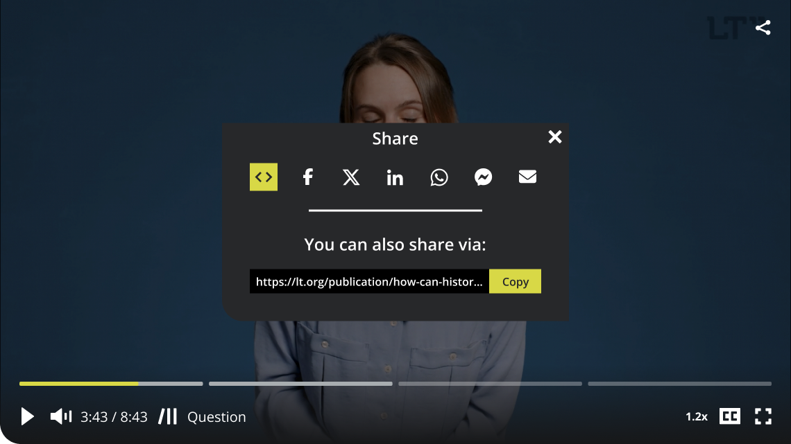
- One player-owned share dialog. Content, strings, theming, and lifecycle are entirely the player's, wherever the dialog appears. Pages never implement share UI; they only trigger.
- Placement follows the trigger. The player's own share control opens the dialog centered inside the player; the page API opens it centered on the page. The content is identical in both placements; only the shell around the card differs. The rules live in the Placement section below.
- The input modes lead the dialog in designed order: link, then embed. The first usable allowed mode is selected when the dialog opens. The input row below shows the selected mode's content, and Copy copies exactly that. Selecting the embed mode swaps the input to the iframe snippet.
- The player generates the embed snippet from the configured embed URL. Consumers supply only the URL; the markup, its attributes, and its future sizing options are the player's knowledge and evolve with player releases.
- The generated iframe delegates its required browser capabilities. Its complete permission list is
accelerometer; autoplay; clipboard-write; encrypted-media; fullscreen; gyroscope; picture-in-picture; web-share. Of those,autoplay,fullscreen, andpicture-in-pictureare the minimum needed for the embed playback contract.clipboard-writekeeps the embedded Share dialog's Copy action available, andweb-sharekeeps its mobile More action available. The snippet also carriesallowfullscreenas a legacy fullscreen compatibility attribute. - The social targets follow the modes: Facebook, X, LinkedIn, and WhatsApp.
- Mobile: the same dialog, plus a "More" button that opens the operating system's native share sheet. The button renders only where the native share API exists.
- Message templates: targets that carry text use a shipped template with
{placeholder}interpolation, overridable per instance. The shipped default isWatch "{title}" by {author} on Latest Thinking: {url}. - Receiver-side previews (social cards) are built from the shared page's Open Graph tags and are the page's responsibility, never the player's.
Placement
- Player placement (the share control, either layout): the dialog is an overlay layer inside the player, centered within the player bounds by CSS, over a dim that covers only the player. Resizing the player re-centers it by layout alone; no script measures or positions anything. In fullscreen it renders inside the fullscreened subtree, unchanged. The card is bounded by the player, by design: this dialog is part of the player experience.
- Page placement (
openShare()from the hosting page): the same dialog opens as a native top-layer modal, centered in the viewport by the browser, over a full-page dim, the way video sites present page-level sharing. It escapes the player bounds but remains the player's element, so theming and strings apply unchanged. - One card, two shells. A single share card component renders in both placements and never knows how it was opened. Placement is decided by the trigger source alone; there is no configuration key for it.
Surface in landscape
- Share trigger icon at the top right of the player, sized from
--ltp-play-control-size, unlesscapabilities.share.playerTriggerisfalse. The dialog itself is layout-independent.
Surface in portrait
- Share occupies the top-icon region anchored at the top-right portrait inset, unless
capabilities.share.playerTriggerisfalse. The dialog itself is layout-independent.
Configuration
capabilities.share.canonicalUrl: the link the dialog shares. Without it, the whole capability is dormant.capabilities.share.embedUrl: the URL the generated iframe points at. Without it, the embed mode does not render.capabilities.share.playerTrigger: whether the player-owned share trigger renders. Defaults totrue. Setting it tofalsehides only that surface; the share capability remains active and the hosting page can still open the page-placed dialog withopenShare().capabilities.share.targets: optional allowlist trimming the target set. It acceptslink,embed,facebook,x,linkedin,whatsapp, andmore. The designed order is fixed and the full set is the default; configuration order does not reorder the interface.capabilities.share.templates.message: optional template override for text-carrying targets. It accepts{title},{author}, and{url}. Missing title or author values substitute as empty strings; unknown placeholders remain verbatim.
{
  "capabilities": {
    "share": {
      "canonicalUrl": "https://lt.org/publication/how-can-we-quantify-the-impact",
      "embedUrl": "https://lt.org/embed/how-can-we-quantify-the-impact",
      "playerTrigger": false,
      "targets": ["link", "embed", "whatsapp"],
      "templates": {
        "message": "Watch \"{title}\" by {author} on Latest Thinking: {url}"
      }
    }
  }
}
Omitting share entirely keeps the capability enabled with the full designed target set and player trigger, subject to the URL dormancy rules. Omitting playerTrigger from a share options object likewise restores its default true value on configuration updates; omitted never means keep the previous value.
Strings
Share message templates and content values stay in the capability options. The catalog owns the dialog interface and target labels.
| Key | English default | Placeholders | Appears in |
|---|---|---|---|
share | Share | none | Trigger and dialog title |
closeShare | Close share dialog | none | Dialog close control |
shareLink | Link | none | Link mode |
shareEmbed | Embed | none | Embed mode |
copy | Copy | none | Copy action |
copied | Copied | none | Copy confirmation |
shareFacebook | Share on Facebook | none | Social target |
shareX | Share on X | none | Social target |
shareLinkedIn | Share on LinkedIn | none | Social target |
shareWhatsApp | Share on WhatsApp | none | Social target |
shareMore | More sharing options | none | Native-share action |
shareVia | You can also share via: | none | Input-section heading |
Page API hooks
- Open the share dialog from the page (the external share button case) and observe its
shareOpenevent, whose payload carriessource(playerorpage). A page-triggered dialog uses the page placement. Closing does not emit a separate page event.
Edge cases
- Fullscreen: the player placement renders inside the fullscreened subtree; a page-triggered dialog during fullscreen still appears, because the top layer displays above the fullscreened element.
- No native share API: the "More" button does not render.
- Copy uses the asynchronous clipboard API with a selection fallback where unavailable.
- Per-target dormancy applies on top of the allowlist: a target that cannot form a valid share for the current content does not render.
- Link and embed render only when they are allowed, and embed additionally requires an embed URL. The initial mode is the first usable mode in designed order. If an update removes the selected mode, the first remaining usable mode takes over.
- When neither link nor embed is usable, the dialog contains the remaining target rows without an input section or Copy control. When no usable target remains, the trigger does not render and
openShare()is a silent no-op. - There is no dedicated Messenger target in this release. The native More sheet may expose Messenger where the platform supports it. A dedicated target may return in an ordinary release through an optional
messengerAppId.
Out of scope
- Embed sizing options (fixed, responsive, fluid): acknowledged as a future
capabilities.share.embedaddition, not part of the first implementation. - Share analytics.
Design reference
The current playground _overlays.scss declaration is the binding numeric reference. The layout-independent card is min(28.25rem, 100%), capped at min(84%, 32rem) high, with 1.25rem padding, a 1.875rem lower-left radius, and a 1rem section gap. The header uses 2.5rem outer columns, a 1.375rem medium title, and a 2.5rem close control with a 1.75rem glyph. Target controls are 2.5rem with 1.875rem icons. The divider is min(250px, 100%) by 3px; the copy section has a 0.75rem gap and 1.375rem medium heading. The input and Copy control are 2.25rem high, with a 5rem Copy minimum width and 1rem text.
The live announcement and the wrapping needed for an LT-specific target set have no direct donor equivalent and retain their existing architectural behavior. Positioning is never scripted: CSS centers the player placement and the browser centers the page placement, so the playground's numeric viewport fallbacks and owner-supplied center coordinates are not carried over.
Two product decisions supersede details in the design frame: link is the first input mode with embed beside it, and Messenger is available only through the platform-native More sheet in this release.